This should be the only post in the series that won’t be marked “Safe for Seneca”. It cannot be, because I am angry, very very angry, and that will result in all kinds of colourful language.
What the bloody hell were the Android people thinking when they came up with this bullshit action bar to be a replacement for the menu button? The four buttons were one of the (admittedly several) reasons I liked Androids over iPhones. As a user I cannot figure out what I’m supposed to do without it. I feel like an idiot, in fact it reminds me very much of when I borrowed someone’s iPhone once and I couldn’t use it to do anything non-obvious on it (i.e. I couldn’t do anything at all).
Being a developer as well as a user I’ve done my research, for the third time now. Apparently this was a deliberate decision made by the Android team (though I’ll guess not by consensus), it was NOT something pushed upstream by device makers, and there is exactly one document that explains the switch, here it is.
That’s it? Stop using the menu button and start using overflow actions? Really? Have you read your own post guys (or is this entirely your doing Scott, in which case I hate your guts)?
It doesn’t actually tell me what I’m supposed to replace my menu actions with! The action bar? Where is that going to go? Do you know how valuable screen space is on a phone? Do you seriously want me to replace 10% of my valuable content with the name of the application and a couple of meaningless buttons?
Yes, meaningless buttons. How many Android app developers can afford to hire someone to design icons for them? And even if they did, a tiny square with almost any of the default action icons means absolutely nothing to me as a user. Have a look yourself at some samples here, for how many of these can you say “I know what that does”?

Which one of these means “Find person”? “Check for updates”? “Settings”? “Add person”? “Forward”? “Move”? “Donate”? “About”? “Sort”? “Colour”? “Backup”? I could go on and on and on. And I have perfect example of this stupidity: in K9 mail the icon for Move and the icon for Reply is the same. The same! For completely different operations!
And how’s the overflow menu supposed to be better than the menu button? Even though it looks suspiciously similar? Oh I see, it’s more flexible! I can in fact have two action bars instead of one!
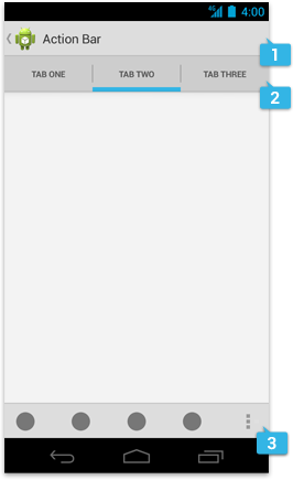
Cause really, why only waste 10% of the screen on a useless action bar when you can waste 20%!
But don’t worry, the old button bar is still there (still taking up space by the way), and it’s more dynamic! We got rid of two useful buttons (menu and search) and replaced them with an awesome… “switch task” button! Cause that’s what the cool new Android phone is really about, switching from one task to another! I do that all the time, though mostly when I imagine my phone is a laptop with a big screen and a fast CPU and lots of memory, and a keyboard and mouse.
Obviously I’m misunderstanding something. I thought the point of using an Android app is to use the app, but clearly the point is to admire the “patterns” Google came up with. I have to admit when I saw the word “pattern” in the two documents I mentioned above I lost all self-control. This is why I hate design patterns! They are not patterns! They are wannabe patterns! Overdesigned shit that doesn’t make things better for anyone despite its intention to make things easier to use for all. A real pattern emerges from observing the actual use of something, a pattern is not imposed. But what a weak distinction, obviously someone else knows better what’s good for me, how silly of me to question.
Do you think that the person who was too stupid to find the menu button will be smart enough to find the action overflow button? And figure out all the different forms that it takes? It took me (a half-decent engineer) hours to understand it, but the moron you made this idiotic change for will find it more easily? Yeah?
I’m very surprised there wasn’t an outrage about this. There are very few things that make me angry these days, but this one is right up there tickling me in the wrong cavity. I know that after some years good app developers will hack their way around this with varying degrees of success, I’ll get used to the new way, and I’ll fondly remember the menu button as Windows 8 users recall the start button, but right now I’m steaming with anger and wishing there was something other than Apple and Google to choose from.